In the previous post on community analysis in California counties, migration patterns were examined and a network was constructed. This post extends the analysis by applying the MR-QAP method.
❓ MR-QAP
Multiple Regression Quadratic Assignment Procedure (MR-QAP) is a specialized regression analysis method designed to analyze network data. Traditional regression analysis operates on the assumption that each data point is independent of each other, but network data is not. For example, the number of people moving from county A to county B can be affected by the movement from county A to county A or their relationship with other counties, so all observations have an interdependent structure. Because of these characteristics, applying general regression analysis as it is can significantly reduce statistical reliability.
To address these issues, MR-QAP performs a regression analysis between the dependent and independent variable matrices, and then evaluates the significance of the regression results using a permutation-based test. A permutation test is a method of randomly mixing rows and columns of a dependent variable matrix, repeating the same regression analysis thousands of times to create a random distribution, and then comparing how extreme the actual regression results are in that distribution. This allows you to calculate the p-value and test whether the influence of that variable is statistically significant.
This method is particularly effective when dealing with data on relationships in matrix form, such as population movement between regions, social networks, and interactions between organizations. In this analysis, MR-QAP was used to evaluate what socioeconomic factors might explain population movement between 58 counties in California.
📦 Data Introduction
Data Sources
1. County shapefile
COUNTY_2019_US_SL050_Coast_Clipped.shp
Used to get county boundaries and calculate distances between centroids.
2. Socioeconomic data
R13859119_SL050.csv with R13859119.txt
Includes population, income, education, unemployment, race, and commute time.
Used to compare differences between counties.
3. Migration flow data
county-to-county-2016-2020-ins-outs-nets-gross.xlsx
Filtered for California-only flows (weight > 50).
Used to build the migration network for MR-QAP.
Data Pre-processing
1. Link
Read the “California” sheet from the Excel file and select the first 9 columns
link = pd.read_excel('county-to-county-2016-2020-ins-outs-nets-gross.xlsx', sheet_name='California', skiprows=2)
link = link.iloc[:, 0:9]
link.columns = [
    'O_state_cd', 'O_county_cd', 'D_state_cd', 'D_county_cd',
    'O_state_nm', 'O_county_nm', 'D_state_nm', 'D_county_nm', 'weight'
]
Filter only within-California migration flows greater than 50
link2 = link[
    (link['O_state_nm'] == 'California') &
    (link['D_state_nm'] == 'California') &
    (link['weight'] > 50)
]
Convert code columns to integer type
link2['O_state_cd'] = link2['O_state_cd'].astype(int)
link2['O_county_cd'] = link2['O_county_cd'].astype(int)
link2['D_state_cd'] = link2['D_state_cd'].astype(int)
link2['D_county_cd'] = link2['D_county_cd'].astype(int)
2. Node
Load socioeconomic data and filter for California counties
node = pd.read_csv('R13859119_SL050.csv')
node = node[node['Geo_STATE'] == 6]
Select relevant variables
node2 = node[[
    'Geo_FIPS',
    'Geo_QName',
    'Geo_STATE',
    'Geo_COUNTY',
    'SE_A00001_001',  # Total population
    'SE_A03001_002',  # White Alone
    'SE_A03001_003',  # Black Alone
    'SE_A03001_005',  # Asian Alone
    'SE_A00002_002',  # Population density
    'SE_A12001_005',  # Bachelor's degree
    'SE_A17005_003',  # Unemployed
    'SE_A14006_001',  # Median household income
    'SE_A09003_001'   # Average commute time
]]
🧭 California County-to-County Migration Network
The migration network is built using filtered flow data between counties.
Only flows with more than 50 people are included to reduce noise.
Create the directed weighted graph
g = nx.from_pandas_edgelist(link2, source='O_county_cd', target='D_county_cd', edge_attr='weight')
Add node attributes
node_attr = node2.set_index('Geo_COUNTY').to_dict('index')
nx.set_node_attributes(g, node_attr)
Calculate degree
degree_dict = dict(g.degree(weight='weight'))
nx.set_node_attributes(g, degree_dict, 'degree')
📐 Preparing the MR-QAP Model
🔽 Dependent Variable (Migration Flows) The dependent variable is a 58×58 matrix showing how many people moved between each pair of counties in California from 2016 to 2020. To focus on meaningful movements, flows of 50 people or fewer were removed. The matrix was created from the migration network using nx.to_numpy_array(). In total, it captures over 1.17 million migration events.
🔼 Independent Variables (Attribute Differences) The independent variables are also 58×58 matrices. Each one shows how different two counties are in a specific attribute, such as income, population, race, or unemployment.
def variable(var):
    var_diff_mat = np.zeros((n_nodes, n_nodes))
    for i, node1 in enumerate(ordered_nodes):
        for j, node2 in enumerate(ordered_nodes):
            if var in g.nodes[node1] and var in g.nodes[node2]:
                var1 = g.nodes[node1][var]
                var2 = g.nodes[node2][var]
                var_diff = abs(var1 - var2)
                var_diff_mat[i, j] = var_diff
            else:
                var_diff_mat[i, j] = np.nan
    return var_diff_mat

var_diff_mat = variable('SE_A14006_001')  # Median household income
var_diff_mat2 = variable('SE_A00001_001') # Total population
var_diff_mat3 = variable('SE_A03001_002') # White Alone
var_diff_mat4 = variable('SE_A03001_003') # Black or African American Alone
var_diff_mat5 = variable('SE_A03001_005') # Asian Alone
var_diff_mat6 = variable('SE_A17005_003') # Unemployed
📏 County-to-County Distance Matrix
Calculate the distance between counties using the centroids of their geographic boundaries.
# distance to network
county['centroid'] = county.geometry.centroid

# an empty graph
dist = nx.Graph()

# save each polygon as a node and get the centroid as an attribute
for index, row in county.iterrows():
    node_id = row['COUNTYFP']
    centroid = row['centroid']
    dist.add_node(node_id, geometry=row['geometry'], centroid=(centroid.x, centroid.y))

# Compute distance between every pair and save it as an edge
all_nodes = list(dist.nodes())
for i in range(len(all_nodes)):
    for j in range(i + 1, len(all_nodes)):
        node1 = all_nodes[i]
        node2 = all_nodes[j]

        centroid1 = Point(dist.nodes[node1]['centroid'])
        centroid2 = Point(dist.nodes[node2]['centroid'])

        distance = centroid1.distance(centroid2)
        dist.add_edge(node1, node2, weight=distance)
📈 MR-QAP Results and Interpretation
independent_networks = [dist_mat, var_diff_mat, var_diff_mat2, var_diff_mat3, var_diff_mat4, var_diff_mat5, var_diff_mat6]

print("MRQAP results:")
print(f"R^2: {r_2:.4f}")
print(f"R^2 based on permutation: {r_2_p.mean():.4f}")
print("-" * 20)
for i, beta in enumerate(betas):
    print(f"Independent var {i+1}'s coeff (Beta): {beta:.4f}")
    print(f"Independent var {i+1}'s p-value: {p_values[i]:.4f}")
    print("-" * 20)
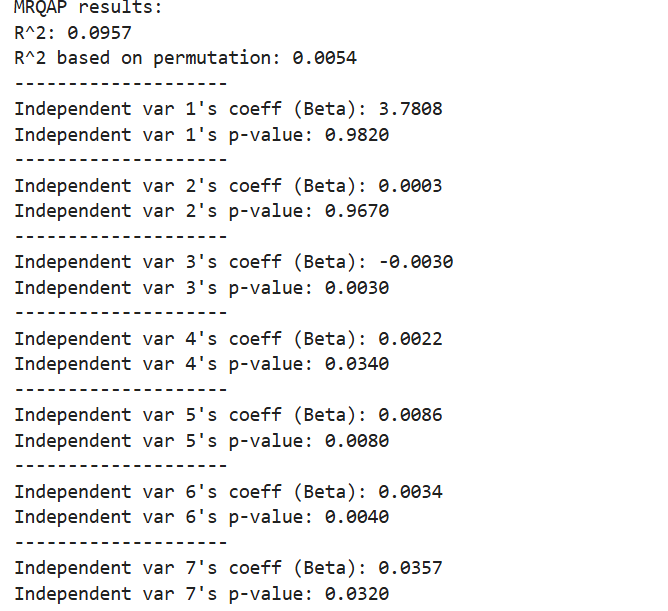
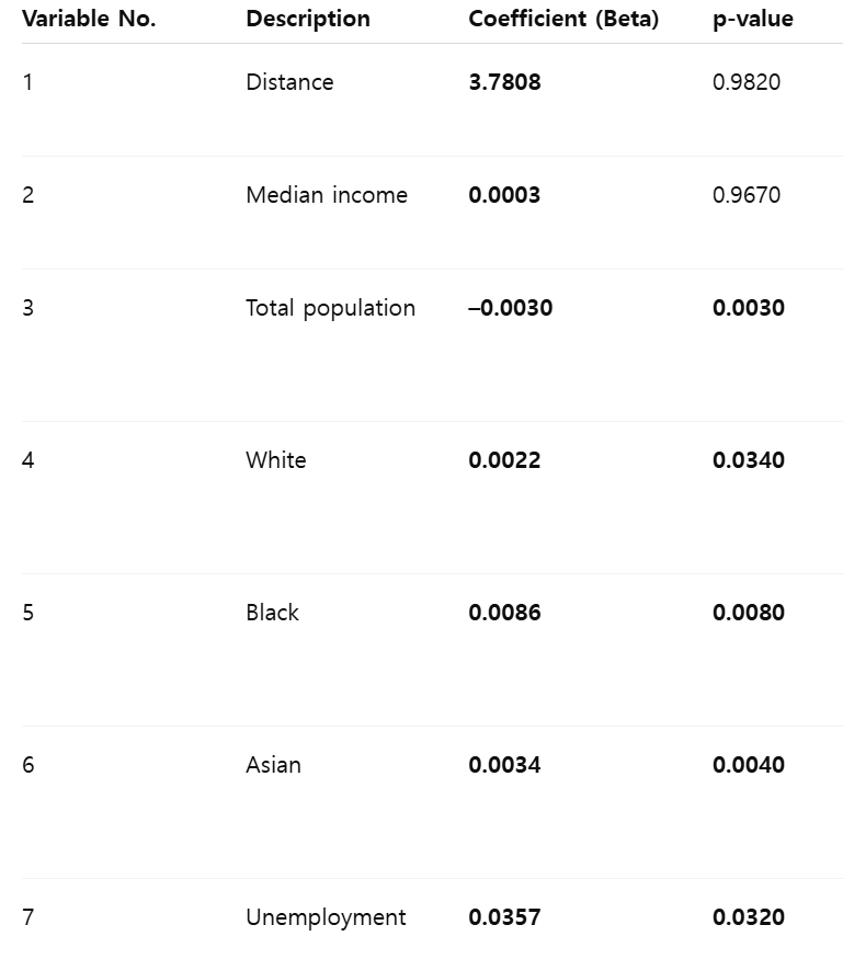
Interpretation
The MR-QAP results show that 5 out of the 7 independent variables had a significant effect on migration between counties. First, distance and median income were not significant, with high p-values of 0.9820 and 0.9670. This means that people do not move simply because counties are closer or richer.On the other hand, total population difference had a significant negative effect (β = –0.0030, p = 0.0030), which means that people are more likely to move between counties with similar population sizes. Differences in racial composition—White, Black, and Asian—also had significant effects. This suggests that people tend to move between counties that have similar racial makeup.The unemployment rate difference was also significant (β = 0.0357, p = 0.0320), showing that counties with similar job market conditions are more connected through migration. In summary, the analysis suggests that migration in California is more influenced by social similarity—such as population size, race, and unemployment—than by physical distance or income level. These patterns are important to consider in planning and policymaking at the regional level.
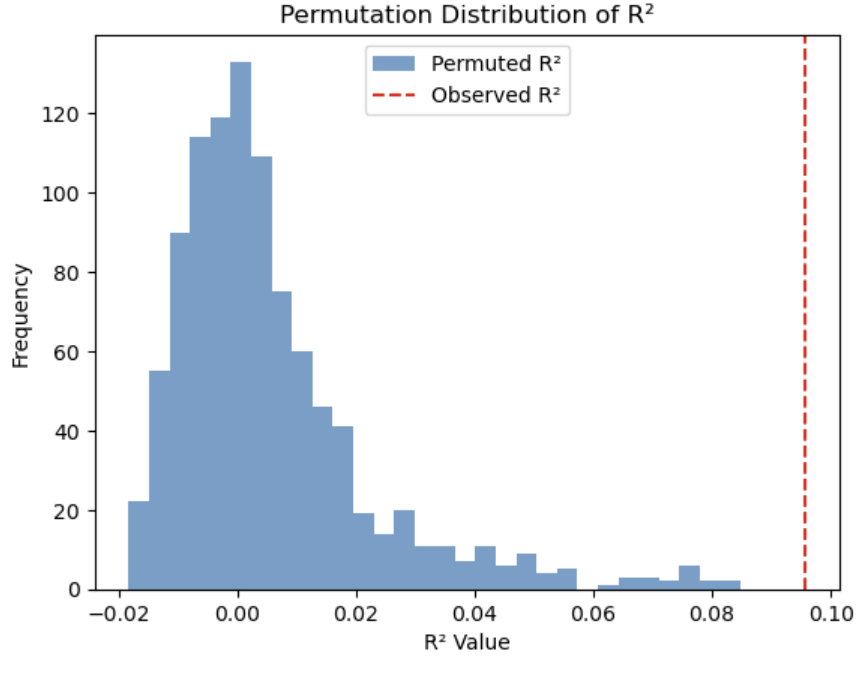
The graph is a histogram showing the distribution of R² values obtained from 1,000 permutations. The blue bars represent the R² values of the randomized models, while the red dashed line indicates the R² value (0.0957) from the actual MR-QAP analysis. Most of the permuted R² values are clustered near zero, with an average around 0.0054, meaning that the randomized models have very little explanatory power. In contrast, the R² from the actual model is much higher—above 0.09—demonstrating significantly stronger explanatory power. Since the observed R² is located at the far right of the distribution, it is highly unlikely that this result occurred by chance.